Images
Images can be styled in different ways using Materialize
Responsive Images
To make images resize responsively to page width, you can add the class responsive-img to your image tag. It will now have a max-width: 100% and height:auto.
<img class="responsive-img" src="cool_pic.jpg">
Circular images
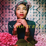
This is a square image. Add the "circle" class to it to make it appear circular.
To make images appear circular, simply add class="circle" to them
      <div class="col s12 m8 offset-m2 l6 offset-l3">
        <div class="card-panel grey lighten-5 z-depth-1">
          <div class="row valign-wrapper">
            <div class="col s2">
              <img src="images/yuna.jpg" alt="" class="circle responsive-img"> <!-- notice the "circle" class -->
            </div>
            <div class="col s10">
              <span class="black-text">
                This is a square image. Add the "circle" class to it to make it appear circular.
              </span>
            </div>
          </div>
        </div>
      </div>
Videos
We provide a container for Embedded Videos that resizes them responsively.
Responsive Embeds
To make your embeds responsive, merely wrap them with a containing div which has the class video-container
      <div class="video-container">
        <iframe width="853" height="480" src="//www.youtube.com/embed/Q8TXgCzxEnw?rel=0" frameborder="0" allowfullscreen></iframe>
      </div>
Responsive Videos
To make your HTML5 Videos responsive just add the class responsive-video to the video tag.
  <video class="responsive-video" controls>
    <source src="movie.mp4" type="video/mp4">
  </video>